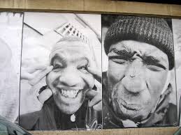
Artistfacts: Subodh Gupta

Banyan Tree
This week’s post is inspired by a fabulous retrospective show of Subodh Gupta’s work at La Monnaie de Paris last spring. It is a shame that it will not be coming to the US.

Subodh Gupta is a contemporary Indian artist, born in 1964, who lives and works in Delhi. He is best known for his monumental sculptures made from every day metal objects, objects often tied to the making or storage of food, objects that are ubiquitous throughout India, such as the steel tiffin boxes, Haandi (serving bowls), thalis (plates), dabbas (containers) and water jugs. The sculptural massing of these objects, their presentation out of the context of a kitchen transforms them from banal to poetic and their meaning from utilitarian to symbolic. This removal from context was all the more vivid in the 17th century Mansart Petit Hotel de Conti that is part of the Louis XV Monnaie de Paris building. Although he is using objects ubiquitous in India, their shapes and uses are easily translated into all cultures.
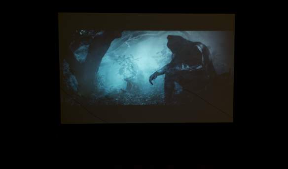
The water is in the pot, and the pot is in the water
Subodh Gupta is looking at the cultural and economic changes not only in India but worldwide that result from globalization and industrialization. Issues of modernization and loss of cultural differences, issues of migration and belonging, issues of consumerism and waste, issues of need and want, subsistence and gluttony.

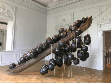
Very Hungry God (2006) made up of stainless steel pots and pans
Cooking and eating, food in general is a universal need. All cultures have rituals in the preparation and eating of food, with the kitchen the center or soul of most homes. Through his work, by his play on scale, his massing of objects and the mixing of media or layering in of technology, Subodh Gupta transforms the domestic to the spiritual, the intimate to the cosmic. There is the dichotomy of excess, gluttony, consumerism and starvation, of the haves and the have nots, of unity versus individuality.

Line of Control– a giant mushroom cloud shaped sculpture made of steel utensils. Although it refers to the line between Pakistan and India, both nuclear armed countries, it clearly reminds the viewer of the devastation that war causes to civilians and the risk of war and nuclear armament.
When he looks at a pot or an utensil, he sees and is showing us not only the pot, but the stories of the people who used the pot. Their lives, their fears and their joys. The utensil is a stand-in, a metaphor for a human life. The burnt out bottom a reflection of the cosmos.

His works also address and confront issues of climate change, the environment, what is wasted, what is reused, consumerism and the unexpected consequences of human actions.
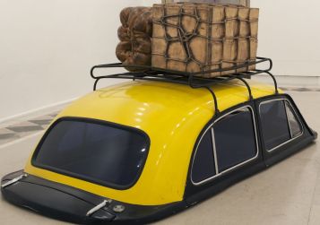
Everything is Inside consists of a ubiquitous in India Ambassador taxi, cast metal luggage on its carrier with the bottom half cut off so it looked like it was overwhelmed by water or sunk into the ground, being swept away by the monsoon, a person’s life and possessions lost.
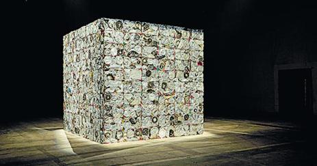
Unstruck consists of a cube or house made of bricks formed from pressed and fused kitchen utensils and strips of brightly colored cloth, behind the cloth and within the chinks an eye looking at the viewer.
The titles are often humorous Two Cows (2003) pictured below consists of two cast in bronze bicycles with milk churns ready to be delivered. The bronzing of a utilitarian object ennobling it and elevating it.

In the same way he bronzed a toilet and set it next to its more commonplace twin, still far more luxurious than what is often available in India


He alternates between pieces made of found objects, ready-mades and pieces profoundly marked by the artisan’s hand, playing with issues of organic versus industrial. The addition of technology, the contrast between the shiny and the used add tension and visual interest to his works.
Casts of the luggage typically carried by workers returning from the Gulf placed on trolleys, luggage and trolleys are cast in bronze. The titles of such pieces are both humorous and poignant “Dubai to Mumbai” or “Vehicle for Seven Seas”. Cloth bundles elaborately tied with string now bronzed become the precious objects they are in reality to their owners, forcing the viewer to consider the intense poverty and difficulty of these migrant workers seeking to survive.


Vehicle for Seven Seas and Fire
There are several artists that use everyday objects in creating large sculptures and for each of these artists the material they choose and the messages they seek to convey are markedly different. To review a few:
Tara Donovan uses everyday materials such as styrofoam cups or drinking straws to create large scale sculptures with organic forms thus metamorphosing them from the very banal into constructs often site specific that are organic and amorphic and poetic.


Song Dong in Waste Not, made an installation showcasing more than 10,000 objects accumulated by his late mother—everything from pots to shoes to toothpaste tubes, focuses on details of a human life and ideas of memory.


Damien Hirst, in particular in the series, ‘Medicine Cabinets’ or ” Pharmacy” has used ubiquitous household items but with a darker Pop Art aesthetic to address his preoccupations of mortality. His work, For the Love of God, as with Gupta’s Very Hungry God incorporate the skull but Hirst uses diamonds instead of stainless steel to create his .


Sculptor and installation artist Robert Gober has used the art of trompe l’oeil, meticulously handcrafting common household items, human body parts and Sudobh Gupta has also used this method. However the meanings and references are very different with Gober focusing more on exploring themes of family, religion, sexuality, alienation.


While Gupta has Atta, a loaf of bread made of bronze but covered with flour.

Ai Wei Wei has also produced some large conceptual installations traditional Chinese modes of thought and production. In particular, bicycles have been used extensively, as symbols of the freedom to move as well as a strong symbol of the changes occurring in China.


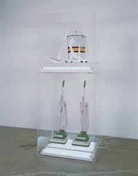
Jeff Koons with The New placed vacuum cleaners manufactured by iconic American companies such as Hoover in illuminated perspex boxes, the vacuum cleaners carefully presented alone or in small curated groupings, symbolising wealth, elite consumerism, of more implicitly sexual pop culture.
Leonardo Drew’s sculptures often look like they were made from an accumulation of found objects but in fact are made of materials (wood, cotton, paper) that he has “aged” or spoiled, weathered, oxidized, burnt.


El Anatsui transforms found materials, in particular liquor bottle caps into carpet wall sculptures of color commentating among other things on issues of globalization and trade.


The last two artists I will relate Gupta’s work to are:
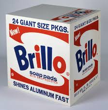
Andy Warhol in particular with the Brillo Boxes where he replicated a common household item
Duchamp and the use of the Ready made into an art object. Sudobh Gupta makes that influence quite clear himself in a piece included in the show at La Monnaie de Paris, where a urinal found at a flea market is filled with what look like real but are actually cast mangoes.

Wash before eating
He is married to a fellow artist Bharti Kher and in an article by Girish Shahane from January 2007 he claims that she said to him “Subodh what you’re creating is no good” and he realized that “he was not doing himself justice” and moved away from painting to installation art and new media art. He set himself apart through a use of materials intrinsic to Indian culture.
Unfortunately, Subodh Gupta was accused of repeated sexual misconduct as of December 2018 and he has stepped down from his role of co-curator of the Serendipity Arts Festival in Goa. The artist has denied the charges. If true it is unfortunate that such a brilliant artist will be tainted by such actions.


edof5")


")

")
 Artistfacts: The Art Review Power 100